Having worked in the Office Fit Out and Refurbishment Industry for over 30 years it is safe to say that I have seen numerous changes, particularly in terms of office design.
In the old days office design generally consisted of some brown “hairy” carpet tiles and a coat of white (or later magnolia) paint on the walls.

Nowadays the design of office spaces can be as challenging as the most discerning residential brief and less has definitely become more.
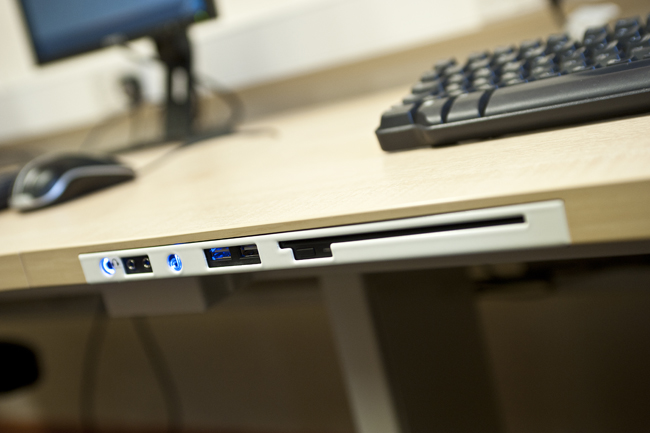
Take the cabling….gone are the days when trailing wires and over-loaded extension leads were the norm. Cable management systems are becoming more and more sophisticated and discreet and systems are often completely wire-less.

And the glazed partitioning, formerly a painted block wall with a timber window set in it, or a heavy aluminium framed system, in a bright colour if you were truly innovative, has been replaced by the slimmest “frame-less” glass, giving a sleek, contemporary feel to the most dingy office space. Manifestation is used not only to comply with the Building Regulations but also to display your company brand and personalise your space. (Pic)
The draw-backs of frameless glass (poor sound reduction and lack of privacy) have been overcome with a range of double glazed partitioning systems, acoustic glass and heavily frosted manifestation
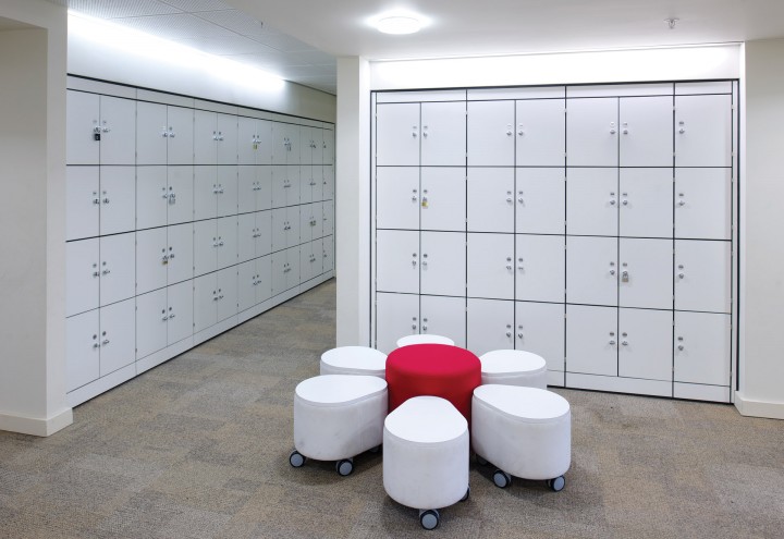
The dawn of the technological age has inspired us to strive for a paper-less office and computer-less desks, as readers of my previous blogs will know. Whilst this is not proving to be as easy or wide-spread as we might hope, products such as storage wall, allow us to at least keep our papers filed away tidily. The designs are much improved from the timber built-in cupboards of yester-year with frosted glass or brightly coloured melamine doors and an extensive range of fittings, including electronically operated lockers.

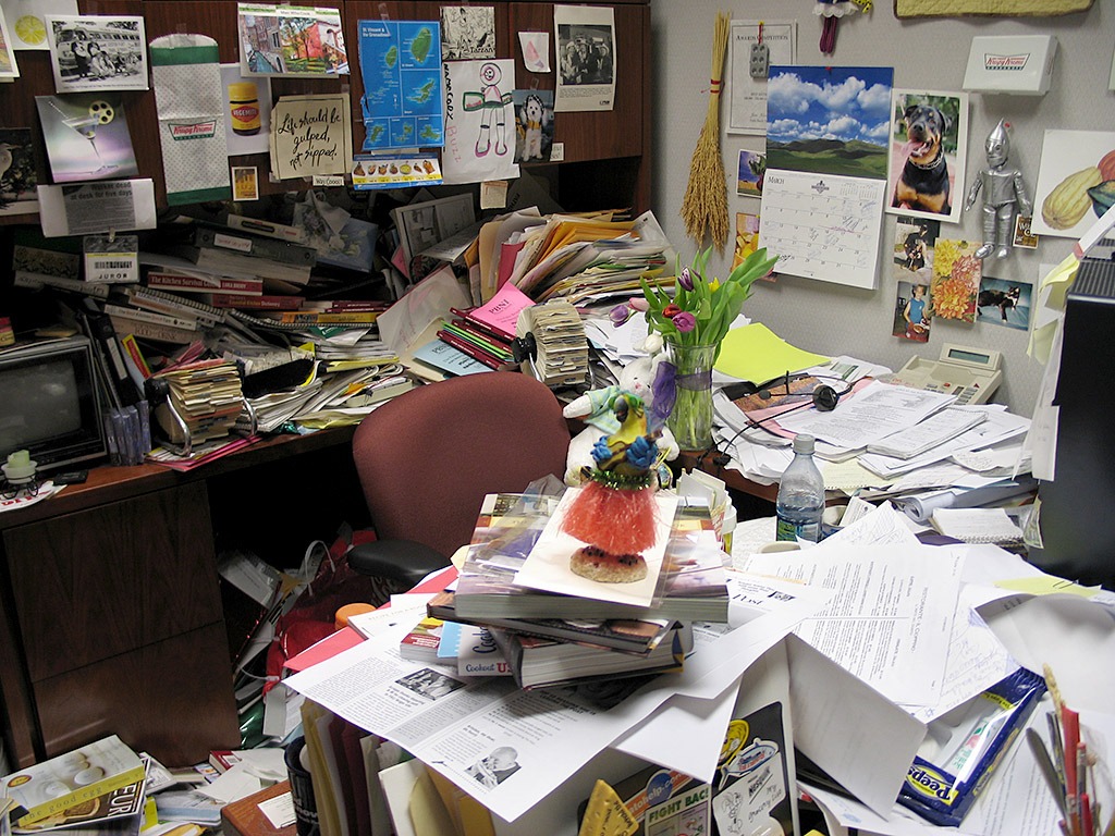
In an ever increasing image conscious age the cluttered desks of the last century have been replaced with bench systems, often in cool white with screens on monitors,
The buzz word of the last few years is minimalist which the dictionary defines as:
Minimalist (adjective)
sparse, simple, basic, plain, bare, discreet, spartan, unadorned, unfussy
At CID we challenge these definitions in our design and build of office spaces. Simple but not necessarily basic, unfussy yes but never bare, definitely discreet but not plain. We also aim to add a few definitions of our own….
Smart – efficient – organised – functional – ergonomic – stylish – sleek – clean.
Whatever you choose to call it the minimalist look that is clearly here to stay….no pun intended!
Posted By Belinda Wright


